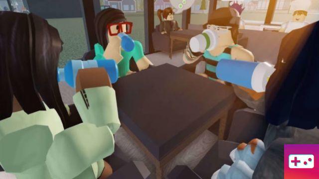
Roblox has one of the most passionate communities in all of video games, and everything related to it tends to be separated and discussed. One such example would be its logo, which has been redesigned several times over the years and always ends up causing a bit of a stir. Some of these redesigns have often been fairly minor, but many of Roblox's early logos are now completely foreign to modern or younger players.
The number of logo changes should come as no surprise, given that Roblox is now 14 years old. It's often easy to forget his age thanks to his popularity with younger players and the fact that he remains so relevant and even forward-thinking in many ways.
Yes, Roblox was launched in 2006, but did you know that the company was founded two years prior by David Baszucki and Erik Cassel? That's when its very first logo was revealed, and that's where we'll begin our look back at the history of Roblox logos.
The Roblox Logo Through the Ages
Generation one
This one is definitely showing its age, isn't it? Nevertheless, it's a nice part of the story that also shows how far Roblox has come. The variegated colors look quite playful, although perhaps a bit too close to some of Google's earlier designs. This one didn't stay long, and it was followed by a radical new look.

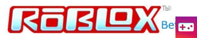
Generation two
The first major logo redesign was also one of his craziest. Just look at that striking red outline and the little accent on the 'o'. Sure, we're painfully in the mid-2000s, but it's so distinct and retro by today's standards that you can't help but appreciate it.
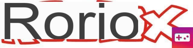
Third generation
This one was another huge departure from what had come before. It looks much more kid-friendly and fun than the previous logo, perhaps in an effort to get younger gamers involved.
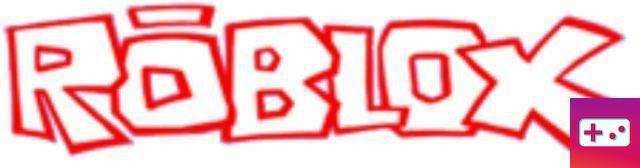
Generation four
This was a very iterative redesign, refining the previous concept without changing things too much. It's a big improvement over the third-gen design, and it's generally much nicer to look at.
Generation Five
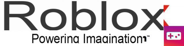
The fifth major Roblox logo arrived in early 2017 and offered the cleanest overhaul yet. With cute block letters, red coloring and a slanted “o”, this is a very modern logo with a lot to like. In an official company update, David Baszucki called it “a testament to our cross-platform vision, as well as our commitment to helping the imaginations of children of all ages around the world.”
Logo Roblox actuel
The most recent Roblox logo is another iterative update. It is most often white, but there are also black and even graphite variants. The slanted “o” in Roblox is still used as the key icon in the game.

How to draw the Roblox logo
Finally, here is a handy video tutorial on how to draw the modern Roblox logo. The red coloring is now slightly outdated, but it's an easy fix when you make your own.
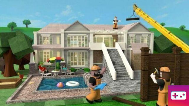
Now you can grab Roblox from App Store and Google Play. And, while you're here, you should also check out our list of Roblox memes, Roblox shirt designs guide, and tips on how to earn free Roblox Robux.